Why does the colour looks so different on screen to when I print it? RGB? CMYK ? Huh? ?
The age old question we hear ALOT! But to be fair, the whole colour thing can be confusing!
Essentially when we are talking about CMYK and RGB, we are referring to a particular colour space.
Let’s break each down and discuss the main uses for each.
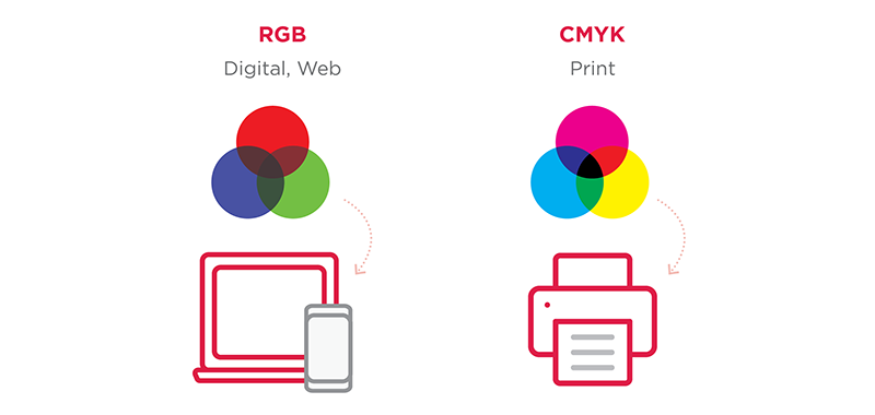
RGB: red, green, blue, which are the primary colours of light.
This colour space is used for digital purposes such as web, digital cameras, scanners, etc.
CMYK: cyan, magenta, yellow, black (K).
Print production requires a four colour process, which refers to CMYK.
 So why do they look so different when printed? RGB colour possibilities is 3×256 whereas CMYK is 4×100 hence why you are unable to reproduce many of the vibrant RGB colours with CMYK.
To keep it super simple, RGB (red, green, blue) is what you see on your screen and how your camera takes photos.
CMYK (cyan, magenta, yellow, black (K) is when you print!
Taking it another step further, a handy tool that graphic designers use is called the Pantone Matching System. Essentially this is a colour standardisation system that helps to identify a colour and match it. The system uses numbers (eg Pantone 287C) so that printers and manufacturers can match colours without having to communicate with each other.
When designing a logo, client’s can opt to choose a colour from the Pantone Matching System Books which match as closely as possible the RGB and CMYK ink formulations under a specific Pantone Spot colour number. This eliminates colour discrepancies when going between web, print, signage, etc by having a specific set of RGB and CMYK values that represent a close match.
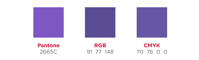 As above shows the slight variation between colours as visible on a digital screen. It is important to remember that when they are used for their primary purpose (web vs print) the match will be as close as possible.