Have you ever been asked for a document with bleed and crops, Huh? ?
You are in talks with the designer and they ask if you need bleed and crops for the material they have designed for you… um what?
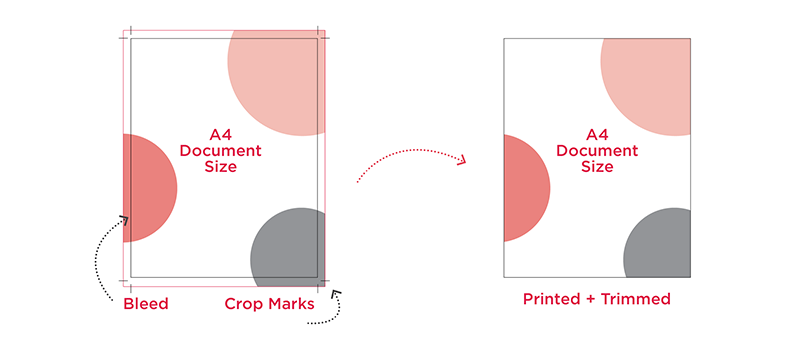
Let’s take a step back and explain what that means! Below is a diagram to help!

➡️ A bleed area on a document is an excess area of usually about 3mm (but differs for each project) that goes outside the finished size of the document. So simply put, you want an A4 printed document, you need to supply this bigger to get the finish you are after…
➡️ Why would we do this? ? Well, printers cannot print edge-to-edge. So that beautiful image that is used on your document or that colour that fill that page would likely end up with a big white border… which is not the look you are going for if you supply the document at the current size with no bleed.
➡️ Well what are crop marks?
Crop marks are small marks that sit on the outer edge of the finished document and show printers where to trim with a guillotine (yes, they are in essence a guide).
➡️ When you provide a file (pdf) with bleed and crop marks they are called ‘print ready files’. These can be sent to professional printers who are able to print and trim the document to final size, maintaining the awesome design finish that was created for your material.
Not only is this important for consistent branding but also ensures your business is conveyed in a professional, refined manner. It is all in the detail peeps!!! ?
➡️ So why wouldn’t all files be designed and provided with bleed?
Good question – each output is different so the need/requirement for the document has to be considered… Sometimes simple documents such as a resume or report that doesn’t necessarily have any colour or images that ‘bleed’ off the edge and therefore, bleed isn’t required.
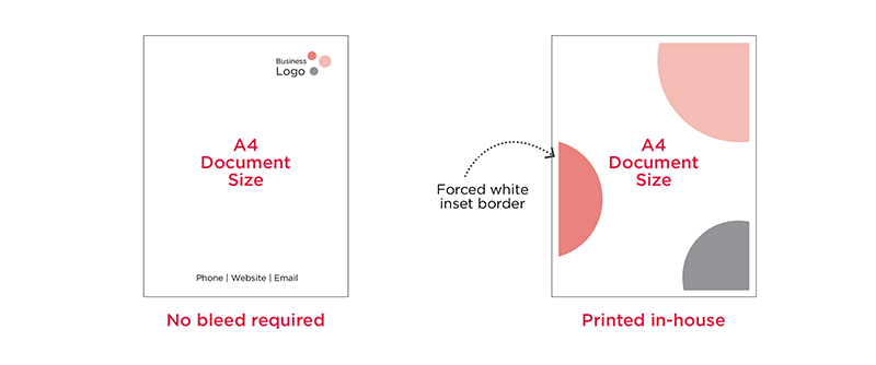
➡️ There are also some instances where businesses choose to print their own documents in house with a basic printer as opposed to a professional printer. In these cases, documents should be designed with this in mind and colour edge-to-edge is avoided if possible. Below is an example of each.
 The letterhead document did not require bleed as no colour runs off the edge of the page.
The second example shows what happens when a document with bleed areas is printed in-house on a standard A4 printer, resulting in the forced white border and unprofessional look. As you can see the output affects the design and vice versa.
At Paliant Design we pride ourselves in designing professional business documents to suit your needs and can accomodate any requirements or limitations.
