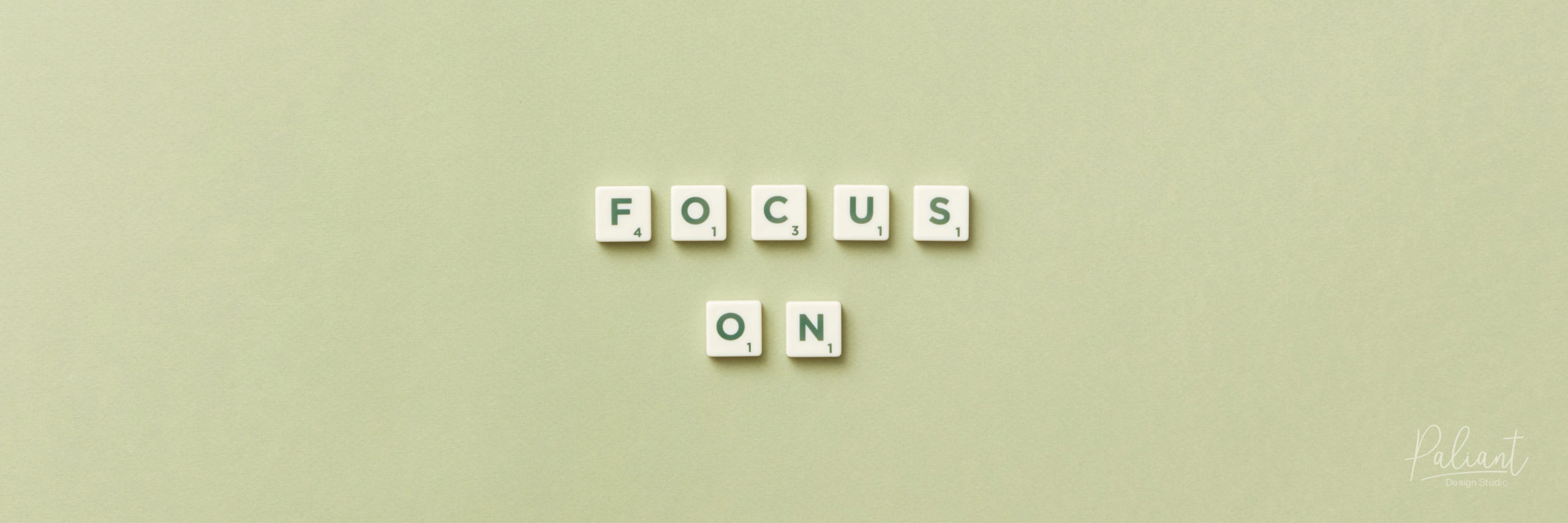
Do you ever feel overwhelmed by the amount of branding and advertising you are faced with in your day-to-day life? Among the madness, have you ever considered what designs usually stand out in the crowd and leave a lasting impression? It’s usually the designs that breathe! Wait what? A design can breathe? Yes! Designs can breathe, and they can also suffocate. It all comes down to the presence of negative space. Negative space, as the name suggests, is the empty space you leave around elements to allow the focal point to stand out. It is an essential in the toolbox of any great designer.
Many people believe that emptiness is bad and that all space needs to be filled. This is not the case at all, in fact it is the exact opposite! Negative space, or ‘breathing room’ as we call it, is the foundation of contrast and harmony within graphic design. Creating negative space allows your focal point, and your brand, to be the star of the show and creates a lasting impression on the viewer. Here at Paliant Design Studio, we are all about negative space, it is our friend! It allows room for maximum impact and readability.
What are the positives of negative space?
- Highlights focal points, your brand, your key message
- Enhances the overall flow, leads the eye naturally through the design
- Enhances visual hierarchy, tells your viewer where to look first
- Allows your design to B R E A T H and does not suffocate your beautiful brand
- Calms your viewer, they are not overwhelmed with information overload!
- Balances your design, so it is not too heavy on one side
- Avoids over designing, keep it simple!
Negative space is not always just plain white, empty space on an artboard or design. It can also be empty space within an image, illustration or photograph. Utilising negative space will ultimately help you hold the viewers attention for longer, rather than just at first glance. Use it to intrigue people, to tell a story, to lead them around your design.
Without negative space, you risk your brand or marketing collateral being lost amongst the sea of other branding and advertising we visually consume everyday. As the old saying goes, less is more!
paliantdesign.com
