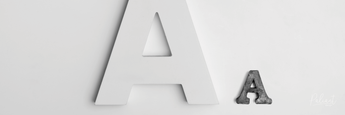
Who shot the serif?! Wait… what is a serif?
Ever heard the word serif or sans-serif? Know the difference? ⠀
⠀
Let us help you with that! ⠀
⠀
Everywhere we look, typography stares right back at us. How do we know which typefaces (fonts) to choose when considering a new logo, preparing a report, creating building signage, even an invitation?
To make it easier for us, there is actually a difference between the visual makeup of all typefaces! Woohoo! There are two groups that categorise typefaces and allow designers and clients to source the ‘type’ of font they are after more easily.⠀
 Let’s start with a serif font. ⠀
⠀
As you can see, it looks a bit more ‘fancy’ than the sans-serif option. Serif fonts are finished with a more decorative stroke at the end of a letters stem, called ‘serifs.’ (Ahh that makes perfect sense!) Serif fonts are commonly used in newspapers and magazines due to their distinct features and readability factor. According to some sources, our brain can identify and recognise letters quicker in a sans-serif font.
The other style is called sans-serif. ⠀
⠀
These obviously do not have serifs hence their name! Typefaces in this category are likely used as headlines, in tables and captions due to the simplicity of their sharp, clean lines. Sans-serif fonts are also favoured for use in web applications due to the low resolution of screens.⠀
Despite their differences, both serif and sans-serif fonts are useful in their ability to convey messages uniquely.⠀
If you are considering a logo design for your new business, are you hoping to achieve a more classic, traditional feel, or something modern and minimal? There is no right or wrong choice!
Each typeface you view has subtle differences so there is an art to finding the right balance and using typefaces to convey the message you want your brand to reflect.⠀
